Your Identity
Your name, address, phone, email, birthdate, and Social Insurance Number.

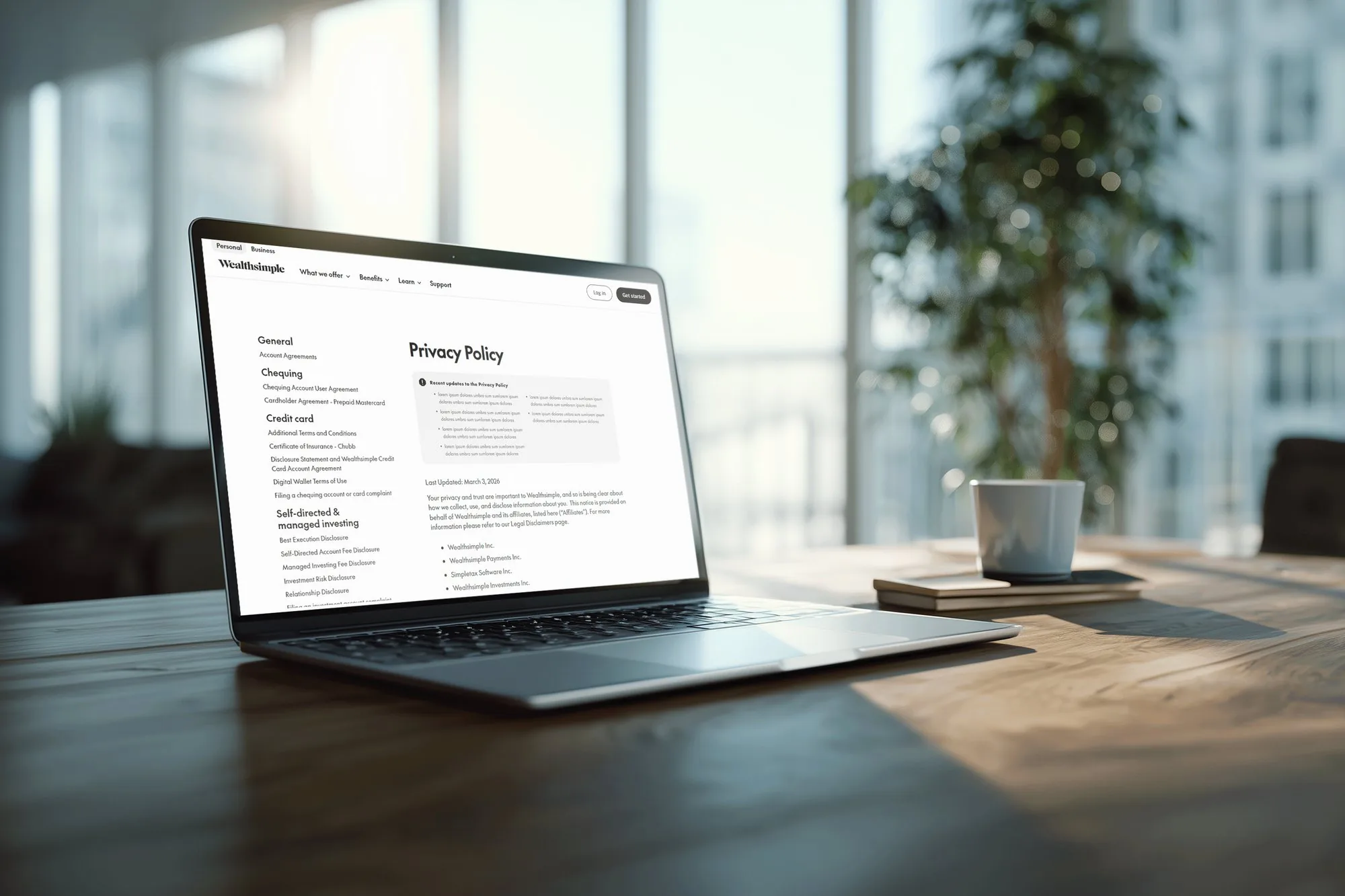
I redesigned how Wealthsimple users find and understand their legal documents, on both mobile and desktop.
Banking apps hold some of our most sensitive information, from our name and email to our social insurance number and tax records. Yet in Wealthsimple’s app, I couldn’t find the Terms of Use without a Google search.
I compared how easy it was to reach the Terms of Service in Uber, WhatsApp, and YouTube, then picked an app with higher stakes: a bank.
Mapping the flow in Wealthsimple showed how hard it was. A user checks Profile, Settings, Personal Information, Login & Security, and every other Settings tab, hitting three dead ends before Support finally sends them to Wealthsimple’s website.
Every tester asked whether the Terms of Use were in the app at all.
They were, just very hard to find.
Your name, address, phone, email, birthdate, and Social Insurance Number.
Copies of your government-issued ID, given to Wealthsimple or one of its service providers.
Transactions from all your bank accounts and credit cards when you connect them through Plaid or Flinks.
Your username, email, picture, and gender if you interact with Wealthsimple’s content on socials.
What you type into Wealthsimple’s AI features may be processed by outside AI companies.
Your information may go to affiliates and outside companies for identity checks, security, fraud prevention, etc.
Based on the research I’d done on user data, I finally came to a problem statement.
How might we give users more control over their data?
I sketched seven features based on this problem:
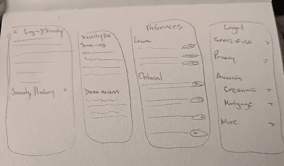
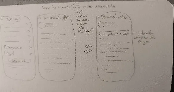
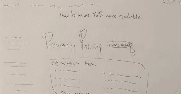


I gave Wealthsimple users trade-off sliders to rate which ideas mattered most to them. I ended up further iterating and incorporating:
On the Single Ease Question (1 = very hard, 7 = very easy), testers rated finding the Terms in the original app 2–3. Testing my mid-fidelity screens led to three changes:
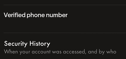
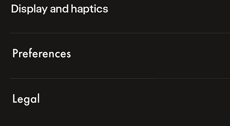
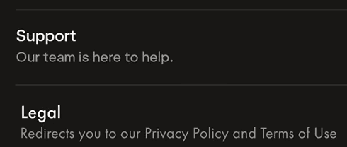
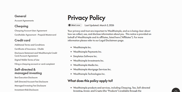
The final changes I chose:
Settings now lives in the bottom navigation bar, with new Legal and Preferences tabs inside it and highlighted links to the Terms of Use and Privacy Policy. On desktop, Legal sits in the account menu.
A recent updates card at the top of the Privacy Policy means users don’t have to reread the whole document every time it changes.
Users can highlight a complicated section to see a plain-language summary, so they can quickly decide whether to read it in full. In the prototype, this is a preset summary demonstrating the concept.
Personal information pages now explain why Wealthsimple keeps each detail, such as tax rules requiring records for 7 years.
Credits: UI assets from Christina’s Wealthsimple Design System on Figma Community. Fonts: Futura PT and Caslon Graphique.